22 Mar 2011

Graphic Design Exhibition @ Somerset House Part four

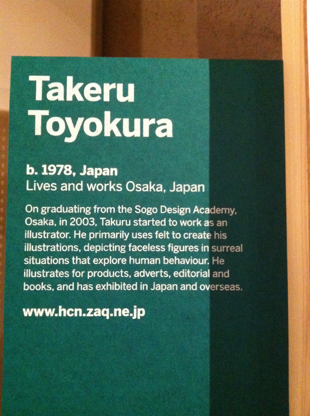
Finally, these art works are my most favorite in this exhibition. They are also created by Japanese. The illustrator is Takeru Toyokura. His art works are filled with surreal stories. At the beginning you glace at his works, you will think they are lovely works filled with children, but as you look carefully, you will realize the stories in his works are quite dark.

I found that Japanese artists are really good at detailed art works, no matter cutting or illustration, they can spend time and make them so fine and delicate!

i love his surreal stories. And look at those houses behind the children, so detailed!

He is so good at using different texture of paper, cloth, and material to create his works.

Can't believe its all made by cutting and paste skill.

The characters in his stories are all children.


This is kind of interested but dark! :)

Differnt texture of papers he uses.

Love those buildings he creates! really vivid!


21 Mar 2011

Graphic Design Exhibition @ Somerset House Part III

After this exhibition, I found that I quite like this kind of illustration that is really detailed and fine. This illustrator use different points and line to creates different texture. This is where inspired me in this exhibition the most. I will definitely use this kind of skill in my illustration next.


Graphic Design Exhibition @ Somerset House Part II

This is one of my favorite art work by a Japanese designer - Seiko Kato
Every Piece of her art works is so fine and detailed. As you can see below, she cut many small piece of illustration and combine them into a bigger illustration. You cant imagine how much time she spends on her works.
Some of her works are for sell, but some of them are priceless.


Green


Flower


Graphic Design Exhibition @ Somerset House Part I

Belows are some art works all made by grid paper. Its quite impressive that these designers are so creative to turn grid papers into various shapes and forms. Here are some of my favorite works.

I realize that repetition is quite attractive thing to catch my eyes. There's a saying in chinese that "Plenty is beautiful". Even something is just simple shape, plenty of them will become beautiful.
This is really creative. The designer is simply cut the grid paper into many pieces and crosses them, but has already sussessfully catch people's eyes.

This one is interested as well. There are lots of designer participated in this "grid paper" project, but some of them made the similar works by chance. The colour and shape in this one is similar like the first one.

So creative! how can they came up with this ideas?

This is my favorite! so simple but so attractive! It's 2D paper but it's 3D!

Grid paper can also become like this! there's no limited! :)