20 Oct 2010

Klang

Last week in Letterpress class, we were asked to use this typeface called "Klang" to design a 300x300mm size big layouts.
At the beginning, i was a bit confused about this task, but glad i have a nice group to discuss and share ideas with each others, so i came up with my ideas soon.

At first, i try to do some research about KLANG on the Internet, but there's not much information about it. Luckily, I still found a short paragraph describing KLANG:

"British designer Will Carter designed Klang™ in 1955. A printer with a respected private press in Cambridge, Carter was also a skilled calligrapher. He combined his expertise with press and pen in creating this strong, masculine calligraphic-style sans serif. Klang leans at a slight right angle, giving the impression of movement. Klang is an ideal typeface for casual display typography where the touch of the artist's hand is welcome."


I kept reading this paragraph many times to try to come up with some ideas. Finally i focus on the keywords!
I grab the "keywords" of KLANG from this paragraph, and tried different layouts on my sketch book:


 Finally, I made these keywords to become the background:


After sharing this idea to my group, i realized that i forgot an important thing that the biggest and smallest size of words we can use are 48 pt and 14 pt. ^O^"
Looks like I have to try some more ideas based on the rule! ^^


Here are some cool layouts from my group:

Designed by Asa

Designed by Jess


13 Oct 2010

Interesting Design

  I definitely cant comprehend after drinking

lol....


name card of a a plastic surgeon :)

sleepy...

cant stop laughing with this....lol

wow...@@"


wish i can own one i winter :D

vanishing chair...

Don't they look like birds?


wanna be in lasagna?

11 Oct 2010

Leaf


Leaf can be like these:


 other classmates' works


 This one is creative I think :)
 

Draw

At the beginning of the Image class, we were told to choose an object to draw( I chose a cute little robot ), and we had to finish drawing in 5 mins, so below is my first try:

Most of the details on the robot was drawn on it! Nearly perfect i think! ;P


In the second try, tutor told us to draw without seeing the paper!!! It sounded impossible! but we still did it, just with more giggles all around this time! :D And his was the result:

lol..... :D


Third try: the one right hand side, I couldn't help looking at the paper, so it still looked ok! But i tried drawing another one which on the left hand side totally without seeing the paper, it was still funny but with improvement!! :D


Great new experience of drawing!!!

9 Oct 2010

Collage

Friday's Image class we learned about Collage.
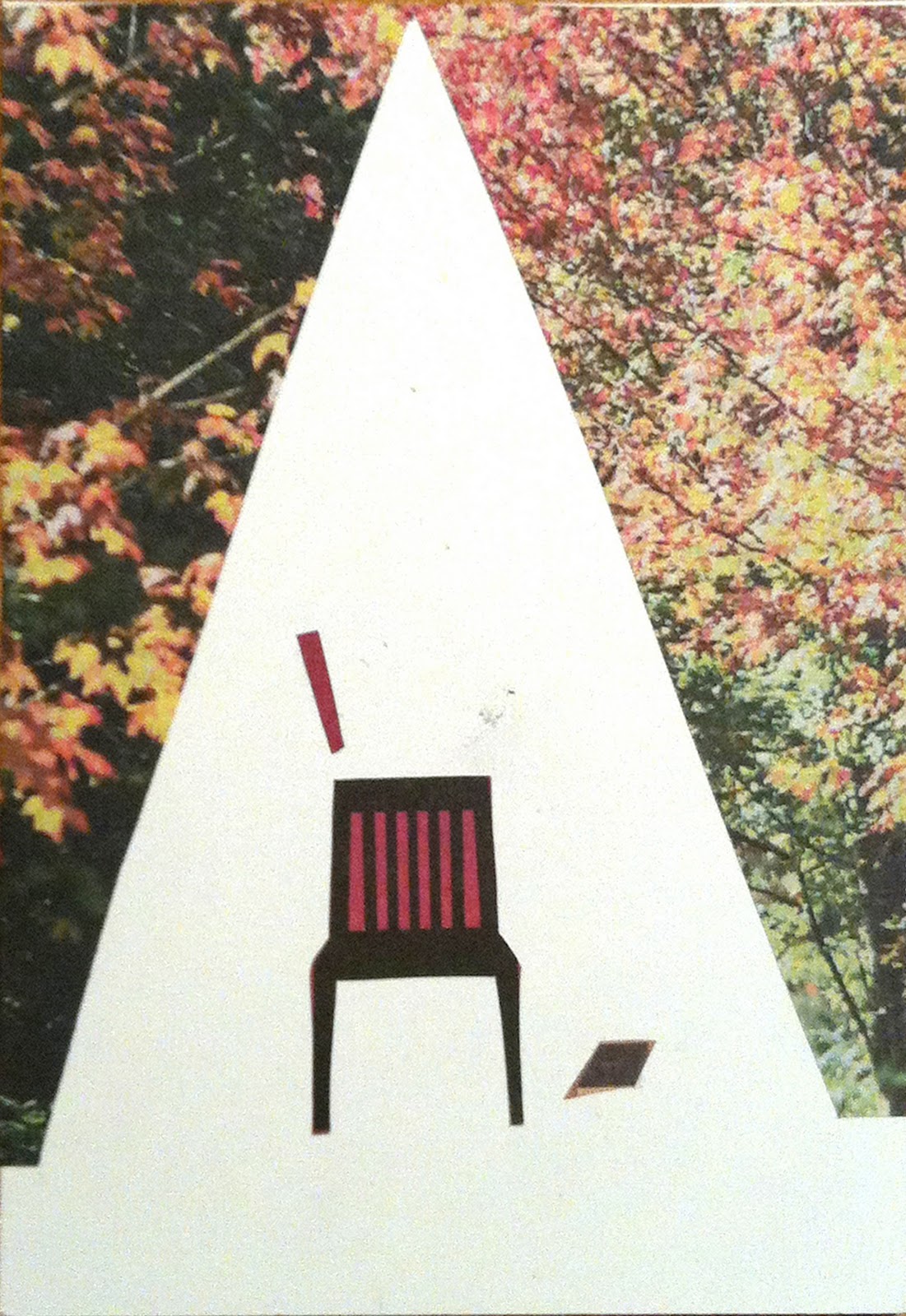
This class was so fun that we were told to cut and paste from newspapers to a postcard size paper.
In the first try, tutor gave us some themes which were: Composition, Editing, Contrast, Rhythm, Texture, Repurposing, Juxtaposition, Surrealism, Narrative and Humour. I chose Surrealism for my first collage.

 My first try: Surrealism

In our first try, most of us didn't give too much "white space" in our collage, so that themes in the our collage may not stand out easily, so under tutor's direction, we made our second try with more white space.


The idea is much more clear than first one! amazing "white space"!


In the third try, we were told to made 5 collages which were using one, two, three, four and five pieces of pictures in each collage. ( Time limited )

1

2

3

4

5
 

My working process was did 2, 3 and 4 at first, and then 5, the last one was 1. 
I found it wasn't easy to do collage by limiting how many piece of pictures to put in a collage. Because with the limitation, we have to think about the space and what kind of image is necessary to put or not. The most hardest one for me was working on the collage with only one picture on it. Simplest is the hardest, how to made an image to be standing out and also consider about its meaning with just one picture is not easy. It took me some times to keep finding the perfect one to put, finally i ran out of the time and as the result you can see, I'm not satisfied with it. :p

I really had a great time in this class. After class, we even kept talking about how fun we had today. I love the working process and sharing works with each other. Although i found that "Simple is not easy!", I like the challenge and I will keep trying!

In the end of the class, we were told to collage 100 cards until the end of this term, how excited! cant wait to put myself in the collage world!


8 Oct 2010

Text and Image

Today's VCT class was about text and image. We did a little game which was to combine some texts and post cards together, and then described to other groups why we made them connect with each other.

Through this game, we realized that we all read the texts first before finding the images to match with.
  
I found it interesting because i never thought about text was so important for graphic design. For graphic design, the first thing i would come up with was "color", i never thought about text was the soul to transmit the massages to our audience. Text is the medium that graphic designers communicate in.

In next weeks of this class, we are asked to bring an example of a text and image combination that we find interesting, so I did some research on the Internet, and i found these designs which inspired me a lot below:


This one is interesting because when I looked at it at first, i couldn't tell that there were 4 Chinese words combined with together to become this image. The illustration in the 2 red Chinese words is what the meaning blue ones about! 


This one would be my favourite! The image we see is totally combined with texts!